Distributions
Martin Vonk - 2025
This notebook guides you through the process of selecting and fitting probability distributions to time series data, with the aim of calculating a Standardized Drought Index. It is divided into three main parts:
SciPy distributions: understanding continuous distribution functions available in
scipy.statsComparing data and distributions: fit candidate distributions to data and assess their suitability
Flexible time scales and distribution fitting: apply fitting procedures to different time scales and understand their impact on the standardized index
This notebook is meant to improve understanding of the statistical underpinnings behind drought index modeling. While some backend code is shown, you don’t need to use of it to compute an SDI in practice.
Prerequisites
Packages
[1]:
from calendar import month_name
from typing import Literal

import matplotlib as mpl
import matplotlib.pyplot as plt
import numpy as np
import pandas as pd
import scipy.stats as sps
from matplotlib import patheffects
from scipy.stats._survival import EmpiricalDistributionFunction

import spei as si  # si for standardized index

si.show_versions()
[1]:
'python: 3.11.14\nspei: 0.8.2\nnumpy: 2.3.5\nscipy: 1.17.0\nmatplotlib: 3.10.8\npandas: 2.3.3'
Helper functions
[2]:
def plot_ecdf(
    ax: plt.Axes,
    data: pd.Series,
    ecdf: EmpiricalDistributionFunction,
    s: float,
    color: str,
    label: str,
    cdf: pd.Series | None = None,
    **kwargs,
) -> None:
    data = data.drop_duplicates()
    ax.scatter(
        data,
        ecdf.probabilities,
        s=s,
        facecolor=color,
        label=label,
        **kwargs,
    )
    if cdf is not None:
        for idata, icdf, iecdf in zip(data, cdf, ecdf.probabilities):
            ax.plot(
                [idata, idata],
                [iecdf, icdf],
                color=color,
                linewidth=0.5,
                **kwargs,
            )


def axes_indicator(
    ax: plt.Axes,
    letter: str,
    x: float,
    y: float,
    ha: Literal["left", "right"],
    va: Literal["top", "bottom"],
) -> None:
    """Add an indicator to the axes."""
    ax.annotate(
        f"({letter})",
        xy=(x, y),
        xycoords="axes fraction",
        fontsize=mpl.rcParams["axes.titlesize"],
        horizontalalignment=ha,
        verticalalignment=va,
        path_effects=[
            patheffects.Stroke(linewidth=1, foreground="white"),
            patheffects.Normal(),
        ],
    )


def plot_box(ax: plt.Axes, dist: si.dist.Dist, bbox_edgecolor: str = "k") -> None:
    textstr = f"{dist.dist.name}\nparameters\n"
    textstr += f"c = {dist.pars[0]:0.2f}\n"
    textstr += f"loc = {dist.loc:0.1f}\n"
    textstr += f"scale = {dist.scale:0.1f}"
    ax.text(
        xmax - bin * 1.5,
        0.05,
        textstr,
        fontsize=mpl.rcParams["legend.fontsize"] - 0.5,
        horizontalalignment="right",
        verticalalignment="bottom",
        bbox=dict(
            boxstyle="round", facecolor="white", alpha=0.5, edgecolor=bbox_edgecolor
        ),
    )
Time series data
[3]:
dfi = pd.read_csv(
    "data/CABAUW.csv",
    index_col=0,
    parse_dates=True,
)
surplus = (dfi["prec"] - dfi["evap"]).rename("surplus")
surplusm = surplus.resample("MS").sum()
SciPy distributions
scipy.stats contains a wide array of probability distributions that you can use to model data.
[4]:
scipy_continious_dists = sps._continuous_distns.__all__
print(f"Number of continuous distributions: {len(scipy_continious_dists)}")
print(f"Examples: {scipy_continious_dists[0:10]}")
Number of continuous distributions: 217
Examples: ['ksone', 'kstwo', 'kstwobign', 'norm', 'alpha', 'anglit', 'arcsine', 'beta', 'betaprime', 'bradford']
Lets inspect one of the available distributions:
[5]:
pearson3 = sps.pearson3
pearson3?
As can be seen the continuous distribtion has a lot of different methods. Most important for this notebook is the fit method. The fit method, by default, uses a maximum likelihood estimate. The method returns the shape parameters (loc, scale and others) of the distribution. Lets see what that looks like for one month of data:
[6]:
surplus_feb = surplusm[surplusm.index.month == 2].sort_values()

fit_parameters = pearson3.fit(surplus_feb)
fit_cdf = pearson3.cdf(surplus_feb, *fit_parameters)
print(
    "Fit parameters pearson3: loc={:.2f}, scale={:.1f}, skew={:.1f}".format(
        *fit_parameters
    )
)
Fit parameters pearson3: loc=0.24, scale=38.5, skew=26.9
Compare the fitted distribution to the Emperical Cumulative Density Function (similar to the cumulative histogram).
[7]:
f, ax = plt.subplots(figsize=(5.0, 3.5))

ax.plot(surplus_feb, fit_cdf, color="C1", label=("Fitted pearson3 CDF"))
e_cdf = sps.ecdf(surplus_feb).cdf
plot_ecdf(
    ax=ax, data=surplus_feb, ecdf=e_cdf, s=10, color="C0", label="ECDF", cdf=fit_cdf
)
ax.hist(
    surplus_feb,
    bins=e_cdf.quantiles,
    cumulative=True,
    density=True,
    alpha=0.3,
    color="C0",
    label="Cumulative histogram",
)
ax.legend()
ax.grid(True)
ax.set_xlim(-20.0, 100.0)
ax.set_ylim(0.0, 1.0)
ax.yaxis.set_major_locator(mpl.ticker.MultipleLocator(0.1))
ax.xaxis.set_major_locator(mpl.ticker.MultipleLocator(10.0))
ax.set_xlabel("Precipitation surplus [mm]")
ax.set_ylabel("Cumulative probability")
[7]:
Text(0, 0.5, 'Cumulative probability')
In the SPEI package there is a little wrapper around this dist class that helps with doing some analysis on the distribution. For instance the two-sided Kolmogorov-Smirnov test for goodness of fit. The null hypothesis two-sided test is that the two distributions are identical, the alternative is that they are not identical.
[8]:
pearson3_pvalue = si.dist.Dist(surplus_feb, pearson3).ks_test()
print(f"Pearson3 Kolmogorov-Smirnov test p-value: {pearson3_pvalue:0.3f}")
Pearson3 Kolmogorov-Smirnov test p-value: 0.747
Say we choose a confidence level of 95%; that is, we will reject the null hypothesis in favor of the alternative if the p-value is less than 0.05. For e.g. march the p-value is lower than our threshold of 0.05, so we reject the null hypothesis in favor of the default “two-sided” alternative: the data are not distributed according to the fitted pearson3 distribution. But not finding the appropriate distribution is one of the big uncertainties of the standardized index method. However, not a perfect fit does not mean this distribution is not fit-for-purpose of calculating a drought index. That is up to the modeller to decide.
Comparing data and distributions
We’ll reproduce some steps that are normally done internally. Therefor we need to create the SI class and fit the distribution. Well do that for two distributions, the pearson3 and fisk distribution. We’ll make a subplot per month and compare the fitted distribution.
[9]:
spei_pearson3 = si.SI(surplusm, dist=pearson3)
spei_pearson3.fit_distribution()

spei_fisk = si.SI(surplusm, dist=sps.fisk)
spei_fisk.fit_distribution()

f, axl = plt.subplots(
    4, 3, figsize=(9.0, 9.0), sharey=True, sharex=False, layout="tight"
)
axsr = axl.ravel()
for (date, distf), (_, distp) in zip(
    spei_fisk._dist_dict.items(), spei_pearson3._dist_dict.items()
):
    i = date.month - 1
    cdf_fisk = distf.cdf().sort_values()
    cdf_pearson3 = distp.cdf().sort_values()
    data = distf.data.loc[cdf_fisk.index]
    e_cdf = sps.ecdf(data).cdf
    plot_ecdf(ax=axsr[i], data=data, ecdf=e_cdf, s=2.0, color="C3", label="ECDF")
    axsr[i].plot(
        data.values,
        cdf_fisk.values,
        color="C0",
        linewidth=1.5,
        label=f"Fisk {distf.ks_test():0.2f}",
    )
    axsr[i].plot(
        data.values,
        cdf_pearson3.values,
        color="C1",
        linewidth=1.5,
        label=f"Pearson3 {distp.ks_test():0.2f}",
        linestyle="--",
    )
    axsr[i].grid(True)
    axsr[i].legend(fontsize=6, title=month_name[date.month], title_fontsize=8)

_ = [ax.set_ylabel("Cumulative\nprobability [-]") for ax in axl[:, 0]]
_ = [ax.set_xlabel("Surplus [mm/d]") for ax in axl[-1, :]]
Both the Fisk and Pearson3 distirbutions seem to describe the precipitation surplus pretty well visually. The p-value of the KS-test, as shown in the legend, is more than 0.05 for all months and distributions however. This might not be an issue if the series are fit for purpose. For instance, the pearson3 distirbutions seems to fit a better for larger surplus numbers. Only for November the Fisk distribution looks significantly better/smoother than the pearson3 distribution.
Flexible time scales and distribution fitting
Meteorological and hydrological time series are nowadays typically available at a daily frequency. To accommodate this, the timescale argument in the drought index function is designed to be flexible, with units that match the frequency of the input time series. For example, when using daily data, a timescale value of 30 corresponds approximately to a one-month drought index, 90 for three months, 180 for six months, and so on.
The frequency at which distributions are fitted (fit_freq) determines how many different distributions are fitted. With a daily fit frequency (fit_freq="D"), one distribution is fitted for every day of the year — 365 or 366 in total, depending on leap years. In contrast, a monthly fit (fit_freq="MS" or "ME") fits a distribution for every month of the year; 12 in total. Although daily fitting is more computationally intensive, it can yield more precise results, as shown in later
sections. Therefore, the number of data points available for each distribution fit depends on both fit_freq, the frequency, and the time length of the time series. For instance, with 30 years of monthly data and fit_freq="MS", each monthly distribution is based on 30 data points. However, fitting a distribution to just 30 values can be challenging — especially for daily data, which is more prone to noise and outliers. By default, the package attempts to infer fit_freq based on the
time series frequency. If inference fails, it defaults to a monthly fit. Users can also specify fit_freq manually for full control.
To improve fit stability, the fit_window argument allows users to include additional data points around each time step. The window size is specified in the same units as the fit frequency. For example for daily data and fit frequency, fit_window=3 includes data from the day before and after a given date (e.g., March 14th–16th for March 15th) for the fitting of the distribution. A fit_window=31 for daily data provides a sample size similar to monthly fitting, while retaining daily
resolution. Though experimental, this fit window feature has shown to improve the robustness of daily fits. A fit window with an even number is automaticaly transformed to an odd number.
[10]:
timescale = 30

spei_d = si.SI(
    series=surplus,
    dist=sps.fisk,
    timescale=timescale,
    fit_freq="D",
    fit_window=0,
)
spei_d.fit_distribution()

fit_window_dw = 31
spei_dw = si.SI(
    series=surplus,
    dist=sps.fisk,
    timescale=timescale,
    fit_freq="D",
    fit_window=fit_window_dw,
)
spei_dw.fit_distribution()

spei_m = si.SI(
    series=surplus,
    dist=sps.fisk,
    timescale=timescale,
    fit_freq="MS",
    fit_window=0,
)
spei_m.fit_distribution()

speid = spei_d.norm_ppf()
speidw = spei_dw.norm_ppf()
speim = spei_m.norm_ppf()
[11]:
month = 4
ts_d = pd.Timestamp(f"2000-{month}-15")
ts_m = pd.Timestamp(f"2000-{month}-01")
dist_d = spei_d._dist_dict[ts_d]
dist_dw = spei_dw._dist_dict[ts_d]
dist_m = spei_m._dist_dict[ts_m]
data_d = dist_d.data.sort_values()
data_dw = dist_dw.data_window.sort_values()
data_m = dist_m.data.sort_values()
cdf_d = dist_d.cdf().loc[data_d.index]
cdf_dw = dist_dw.dist.cdf(data_dw.values, *dist_dw.pars, dist_dw.loc, dist_dw.scale)
cdf_m = dist_m.cdf().loc[data_m.index]
ecdf_d = sps.ecdf(data_d).cdf
ecdf_dw = sps.ecdf(data_dw).cdf
ecdf_m = sps.ecdf(data_m).cdf

fig, axd = plt.subplot_mosaic(
    [["d", "dw", "m", "cdf"], ["si", "si", "si", "si"]],
    layout="constrained",
    figsize=(9.0, 5.0),
    height_ratios=[1.0, 1.2],
)
scatter_kwargs = dict(
    alpha=0.6,
    zorder=2,
    edgecolors="k",
)
plot_ecdf(
    ax=axd["d"],
    data=data_d,
    ecdf=ecdf_d,
    color="C0",
    label=f"Data {ts_d.strftime('%B %d')}th",
    linewidths=0.5,
    s=5.0,
    **scatter_kwargs,
)
plot_ecdf(
    ax=axd["dw"],
    data=data_dw,
    ecdf=ecdf_dw,
    color="C1",
    label=f"Data {ts_d.strftime('%B %d')}th and\n{fit_window_dw} day window",
    linewidths=0.2,
    s=4.0,
    **scatter_kwargs,
)
plot_ecdf(
    ax=axd["m"],
    data=data_m,
    ecdf=ecdf_m,
    color="C2",
    label=f"Data {ts_m.strftime('%B')}",
    linewidths=0.2,
    s=4.0,
    **scatter_kwargs,
)
bin = 5.0
xmin = min(data_d.min(), data_dw.min(), data_m.min())
xmax = max(data_d.max(), data_dw.max(), data_m.max())
bins = np.arange(xmin // bin * bin, xmax + bin, bin)
axd["d"].set_xlim(xmin, xmax)
axd["d"].xaxis.set_minor_locator(mpl.ticker.MultipleLocator(bin))
axd["d"].xaxis.set_major_locator(mpl.ticker.MultipleLocator(bin * 5))
axd["d"].set_ylim(0.0, 1.0)
axd["d"].yaxis.set_major_locator(mpl.ticker.MultipleLocator(0.1))
axd["d"].yaxis.set_major_formatter(mpl.ticker.PercentFormatter(1.0))
for iax in [axd["dw"], axd["m"], axd["cdf"]]:
    iax.sharex(axd["d"])
    iax.sharey(axd["d"])
    for t in iax.get_yticklabels():
        t.set_visible(False)
axd["d"].set_ylabel("Cumulative probability")
axd["d"].set_xlabel("Precipitation\nsurplus (mm)")
axd["dw"].set_xlabel("Precipitation\nsurplus (mm)")
axd["m"].set_xlabel("Precipitation\nsurplus (mm)")
axd["cdf"].set_xlabel("Precipitation\nsurplus (mm)")

axd["d"].plot(
    bins,
    dist_d.dist.cdf(bins, *dist_d.pars, loc=dist_d.loc, scale=dist_d.scale),
    color="C0",
    linewidth=0.5,
)
axd["dw"].plot(
    bins,
    dist_dw.dist.cdf(bins, *dist_dw.pars, loc=dist_dw.loc, scale=dist_dw.scale),
    color="C1",
    linewidth=0.5,
)
axd["m"].plot(
    bins,
    dist_m.dist.cdf(bins, *dist_m.pars, loc=dist_m.loc, scale=dist_m.scale),
    color="C2",
    linewidth=0.5,
)
axd["cdf"].plot(
    [],
    [],
    color="k",
    linewidth=1.5,
    label=f"Fitted {dist_d.dist.name} distribution",
)
axd["cdf"].plot(
    bins,
    dist_d.dist.cdf(bins, *dist_d.pars, loc=dist_d.loc, scale=dist_d.scale),
    color="C0",
    linewidth=2.0,
)
axd["cdf"].plot(
    bins,
    dist_dw.dist.cdf(bins, *dist_dw.pars, loc=dist_dw.loc, scale=dist_dw.scale),
    color="C1",
    linewidth=1.5,
)
axd["cdf"].plot(
    bins,
    dist_m.dist.cdf(bins, *dist_m.pars, loc=dist_m.loc, scale=dist_m.scale),
    color="C2",
    linewidth=1.0,
)

mpl.rcParams["legend.fontsize"] = 8.0

plot_box(axd["d"], dist_d, bbox_edgecolor="C0")
plot_box(axd["dw"], dist_dw, bbox_edgecolor="C1")
plot_box(axd["m"], dist_m, bbox_edgecolor="C2")

axd["d"].legend(
    loc=(0, 1), frameon=False, fontsize=mpl.rcParams["legend.fontsize"] - 0.5
)
axd["dw"].legend(
    loc=(0, 1), frameon=False, fontsize=mpl.rcParams["legend.fontsize"] - 0.5
)
axd["m"].legend(
    loc=(0, 1), frameon=False, fontsize=mpl.rcParams["legend.fontsize"] - 0.5
)
axd["cdf"].legend(
    loc=(0, 1), frameon=False, fontsize=mpl.rcParams["legend.fontsize"] - 0.5
)

axd["si"].plot([], [], color="k", label="SPEI-1")
axd["si"].plot(
    speid.index,
    speid.values,
    linewidth=2.0,
    color="C0",
    label="Daily fit",
)
axd["si"].plot(
    speidw.index,
    speidw.values,
    linewidth=1.5,
    color="C1",
    label="Daily fit with window",
)
axd["si"].plot(
    speim.index,
    speim.values,
    linewidth=1.0,
    color="C2",
    label="Monthly fit",
)

year = 2001
axd["si"].fill_betweenx(
    [-3.0, 3.0],
    ts_m + pd.Timedelta(days=365),
    ts_m + pd.Timedelta(days=365 + 30),
    color="k",
    alpha=0.1,
    linewidth=0,
)
axd["si"].fill_betweenx(
    [-3.0, 3.0],
    ts_d + pd.Timedelta(days=365),
    ts_d + pd.Timedelta(days=365 + 1),
    color="k",
    alpha=0.1,
    linewidth=0,
)
axd["si"].set_xlim(pd.Timestamp(f"{year}"), pd.Timestamp(f"{year + 1}"))
axd["si"].xaxis.set_major_locator(mpl.dates.MonthLocator())
axd["si"].xaxis.set_major_formatter(mpl.dates.DateFormatter("%b%_d\n%Y"))
axd["si"].set_ylabel("Z-score")
axd["si"].grid(False)
axd["si"].legend(ncol=4, loc="lower left")
axd["si"].set_ylim(-3.0, 3.0)
axd["si"].yaxis.set_major_locator(mpl.ticker.MultipleLocator())

axes_indicator(axd["d"], "a", 0.01, 0.98, ha="left", va="top")
axes_indicator(axd["dw"], "b", 0.01, 0.98, ha="left", va="top")
axes_indicator(axd["m"], "c", 0.01, 0.98, ha="left", va="top")
axes_indicator(axd["si"], "e", 0.995, 0.98, ha="right", va="top")
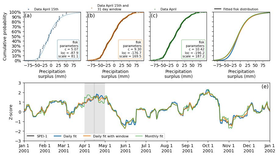
The figure above illustrates the influence of different distribution fitting strategies — namely, fit_freq and fit_window on the calculation of the SPEI-1 index over the year 2001. The top row displays the cumulative distribution functions of precipitation surplus data for an excerpt of the time series of April (the 15th). Subplot a shows the case where distributions are fitted daily (fit_freq="D") without using a fitting window. Here, the fit is based solely on data from April 15th
across 30 years, resulting in a limited sample size and consequently a noisier empirical distribution with a less stable fit. Subplot b also uses a daily fitting frequency but applies a 31-day fitting window (fit_window=31) centered on April 15th. This expands the sample to include 31 days of data, significantly increasing the total number of observations and yielding a much smoother and more robust distribution fit. In contrast, Subplot c shows a monthly fitting approach (fit_freq="MS")
with no fit window, where all April data from each year is used. This produces a stable fit, but because each month is treated separately, sharp transitions can occur at month boundaries, which may introduce artificial discontinuities into the resulting index. This is shown in the red line of subplot e, which is smoother overall but exhibits abrupt changes at the start of each month (e.g., April 1st and November 1st), due to transitions between monthly distributions. These settings allow users
to tailor the standardization process to their data and desired level of temporal precision. Subplot d shows the specific fisk distributions from each parameter set, shown in the text boxes of subplots a,b and c. The changes to the fitted parameter values are obvious, but the fitted distrubtions look similar as seen in subplot d. The result for the z-score is minimal on april 15th but larger for different dates as seen in subplot e.
Comparing fit methods
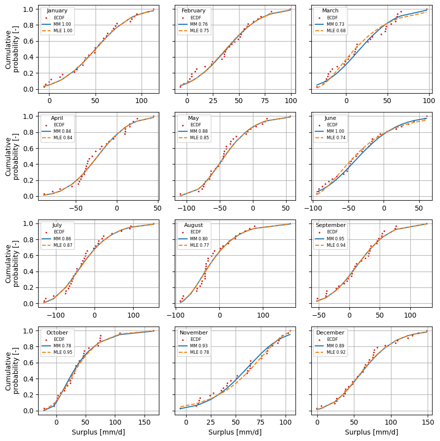
There are two methods available in the SPEI package to fit the data to the continuous distribution: maximum likelihood estimation (MLE) and method of moments (MM). Both methods are supported by default in the SciPy rv_continuous.fit method. They can be called in the SI class using the fit_method keyword argument. The figure below shows the different results for the two fit methods.
[12]:
spei_mle = si.SI(surplusm, dist=pearson3, fit_method="MLE")
spei_mle.fit_distribution()

spei_mm = si.SI(surplusm, dist=pearson3, fit_method="MM")
spei_mm.fit_distribution()

f, axl = plt.subplots(
    4, 3, figsize=(9.0, 9.0), sharey=True, sharex=False, layout="tight"
)
axsr = axl.ravel()
for (date, distf), (_, distp) in zip(
    spei_mm._dist_dict.items(), spei_mle._dist_dict.items()
):
    i = date.month - 1
    cdf_mm = distf.cdf().sort_values()
    cdf_mle = distp.cdf().sort_values()
    data = distf.data.loc[cdf_mm.index]
    e_cdf = sps.ecdf(data).cdf
    plot_ecdf(ax=axsr[i], data=data, ecdf=e_cdf, s=2.0, color="C3", label="ECDF")
    axsr[i].plot(
        data.values,
        cdf_mm.values,
        color="C0",
        linewidth=1.5,
        label=f"MM {distf.ks_test():0.2f}",
    )
    axsr[i].plot(
        data.values,
        cdf_mle.values,
        color="C1",
        linewidth=1.5,
        label=f"MLE {distp.ks_test():0.2f}",
        linestyle="--",
    )
    axsr[i].grid(True)
    axsr[i].legend(fontsize=6, title=month_name[date.month], title_fontsize=8)

_ = [ax.set_ylabel("Cumulative\nprobability [-]") for ax in axl[:, 0]]
_ = [ax.set_xlabel("Surplus [mm/d]") for ax in axl[-1, :]]